
My name is Zachariah Nelson, you can call me Zach (he/him). I'm a software designer from Philadelphia. My career has span various companies across multiple industries, designing software (UX and UI) for consumers, B2B, and enterprises.
I was fortunate enough to have participated in five patents while working at Verizon. These patents cover sending commands with hand-written inputs, managing multiple communication lines on a single screen, and self activating user devices.
In college I found an appreciation for typography and typeface design. I have a couple fonts available for purchase at myfonts.com.
I have over a decade of design experience ranging from marketing, product, UX, presentation, etc. I'm comfortable working in any industry and product team as a lead or support role. I pride myself in being adaptable and efficient in my work.
Keystone is an experimental software production cooperative that explores open and equitable software solutions.
This software is currently a work in progress, and will continue to update as new features and enhancements are introduced.
This software uses the Keystone Design System.
These software build the foundation so that everyone can access and authenticate their data.
Tools to help you communicate with your people, your community, and the world.
This typeface is inspired by one of my favorite Sci-Fi movies of all time, Blade Runner 2049, directed by Denis Villeneuve. In this movie, the primary antagonist is the Wallace Corporation, which serves as my inspiration for this font.
The purpose of this typeface is to be purely decorative and for display purposes. There aren't too many examples of typographic usage in this movie (which is a good thing because we're here to watch a movie not read a movie).
However, this gives me less insight into what the branding of this corporation is and what typeface it needs. From the context of the movie and its accompanying short films, we know that the Wallace Corporation takes over as the dominant replicant manufacturer after the fall of the Tyrell Corporation. Wallace Corporation got their start as a major provider in synthetic farms to be able to feed the growing human population on all planets.
One major clue in the vision and brand of this company is the architecture.
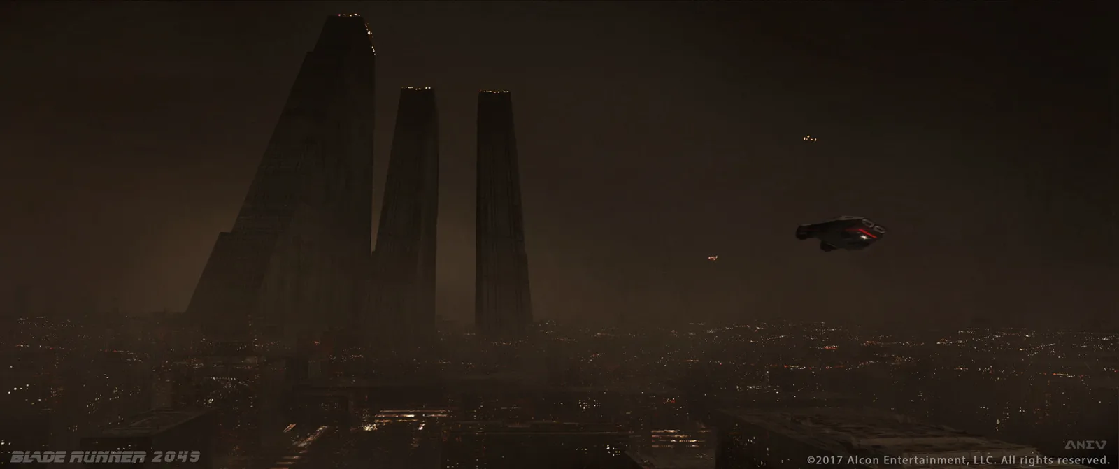
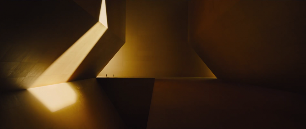
There is a very grand feeling to Mr. Wallace's aesthetic, which is influenced by ancient Egyptian architecture with heavy diagonals of pyramids, yellow lights, and stone everywhere. Two other major themes in the Wallace building are the use of "natural" light and water.
Most rooms, which are barren of any features, are illuminated by what looks like natural sunlight directly above. What should seem normal is actually very striking knowing that the rest of the world outside is mostly shrouded in clouds and rain. Seeing such a warm light throughout makes this place seem like heaven.
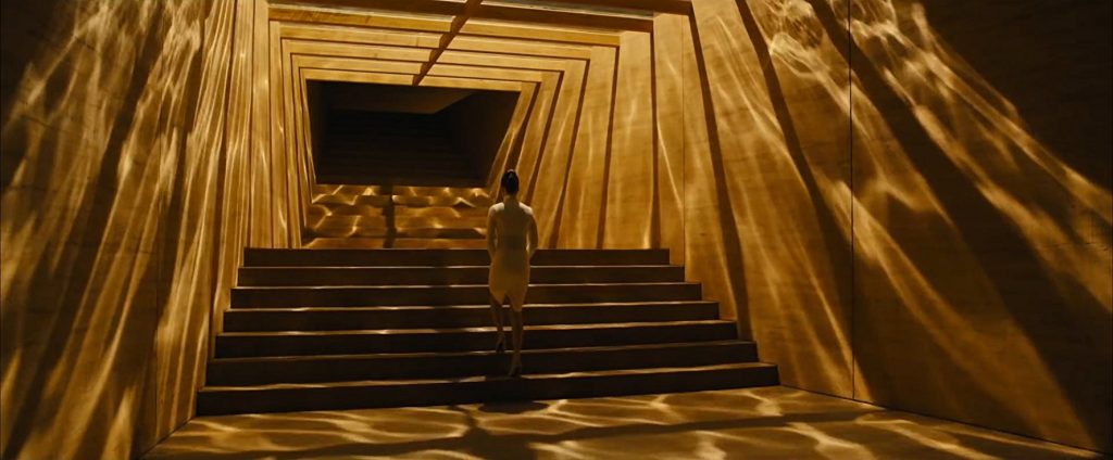
Emphasizing this, the only entrance to Wallace's office is through a set of stairs from the floor. Walking up to the “Kingdom of Heaven" you are surrounded by water and a very direct light from above that spins around, only illuminating parts of the room.
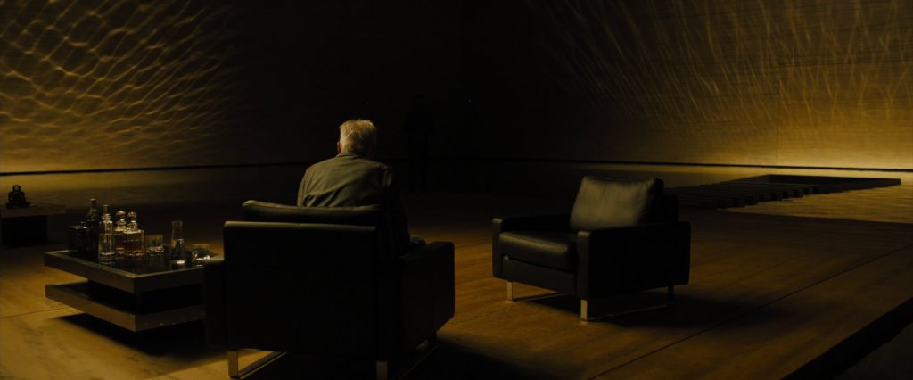
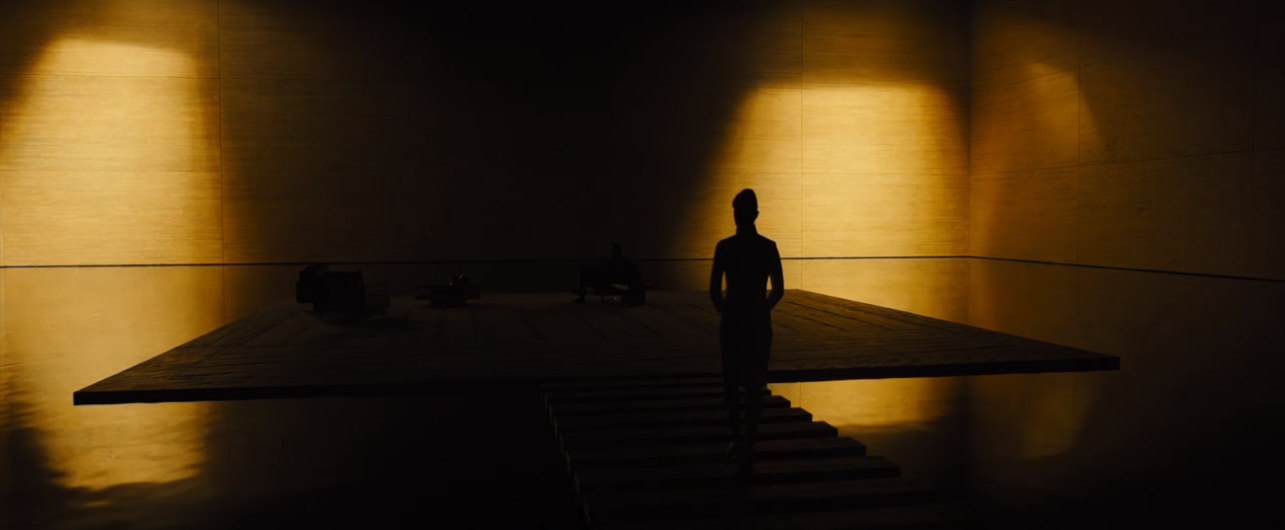
Mr. Wallace absolutely views himself as a god; his new replicants are his angels, the old replicants are demons, and he will stop at nothing to achieve his vision of absolute rule.
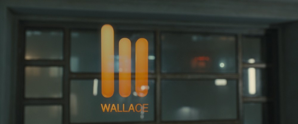
The Wallace logo used throughout the movie where the current type treatment with the logo just using Helvetica can be seen. This is a regular weight sans-serif. Wallace needs to keep the face of a normal corporation that offers services and products, but a man with that much attention to detail should be able to come up with something more striking than Helvetica.
Let's fix that.
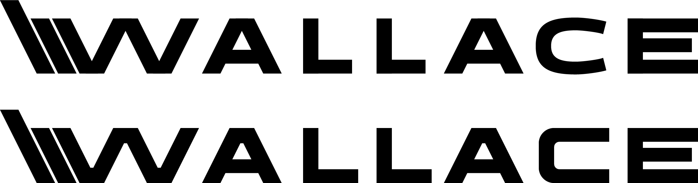
One challenge of creating a new logotype is pairing it with the current logo, which is three vertical rectangles with rounded corners. It's a very easy going and soft logo - something unassuming, which for Wallace's purposes is appropriate. One can't just come off as menacing.
I cheated a little bit and changed the logo, and replaced it with something I felt was more appropriate to the overall brand of the company, pulling directly from the architectural source, the Wallace Building. The beauty of this structure is its immense size, which looms over the once-revered Tyrell Building, is a true testament to Wallace's sense of grandeur.
From this new starting point I explored different options to extend that branding into a logotype, which will become the new foundation for the typeface.


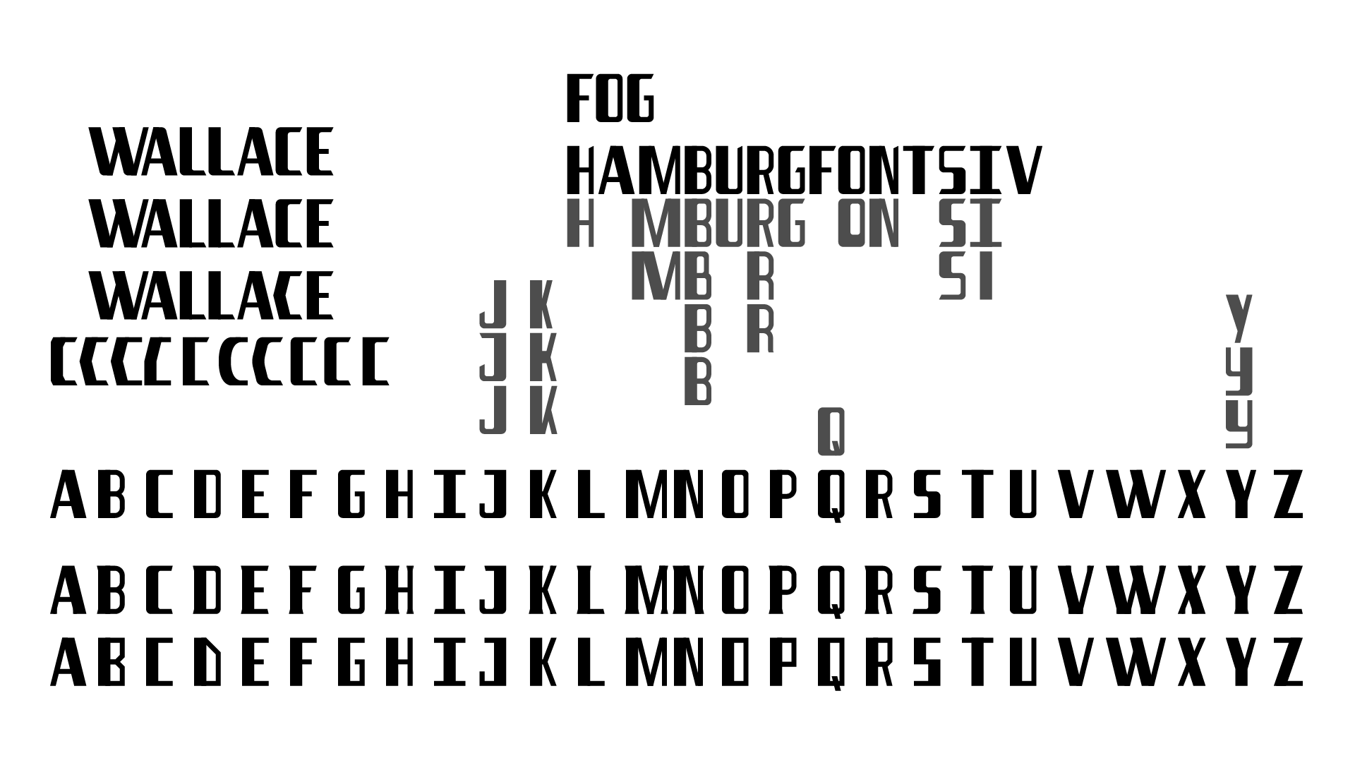

Until I remembered Idlewild, a mid-century industrial inspired font from Hoefler & Co. It simply screams innovation and industry with so much class. Being inspired by Idlewild, I made something a little more robust.
After some quick feedback I changed the C to fit a little more into the grid, having a less natural look helped with the sci-fi theme I was going for. I had my logotype, now to build the whole thing.
The final execution is a typeface that has a solid foundation and one that could be built into the earth. It evokes an industrial look that lets everyone know that Wallace is here to stay and bring you into the future.
The lowercase of the font is an alternative version that has a more sci-fi feel to it with a slick stencil design, something that could easily fit into the cyberpunk world of Blade Runner.
Identity and authentication are not new concepts and solutions. Governments issue federal and state identification through birth certificates, driver's license and state id, passports, social security etc.
Digital parodies exist through account registrars. Every digital service with user accounts require authentication via username and passwords. Third-party verification (via Google, Apple, Facebook etc.) has allowed independent websites and software to have authentication without having to set up a separate onboarding experience. Users don't have to memorize passwords and can just sign in with one account.
Two-factor authentication provides an additional layer of authentication by requiring the user to have a secondary device to provide dynamic passwords. Biometric authentication allows users to use unique body features (ie. face and fingerprints) instead of a memorized password.
Even with these modern digital solutions, they still perpetuate the segregation of information from the user. Accessing your information is still just as cumbersome, replacing password management with process management.
The need for personal authentication should be as simple as showing and verifying your identity. Like security looking at your ID to enter a bar or club. You need some sort of artifact that other people and services can accept.
The person can use their government issued ID to register for a digital ID with an independent registrar. Once the information has been verified, the user will be given a key to unlock their digital ID in their Auth SW.
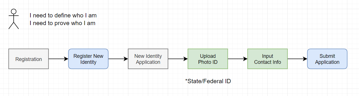
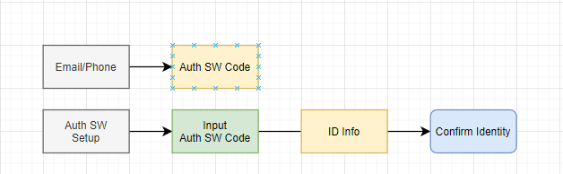
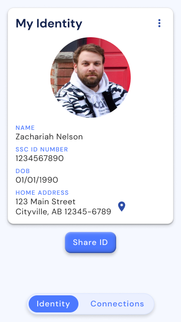
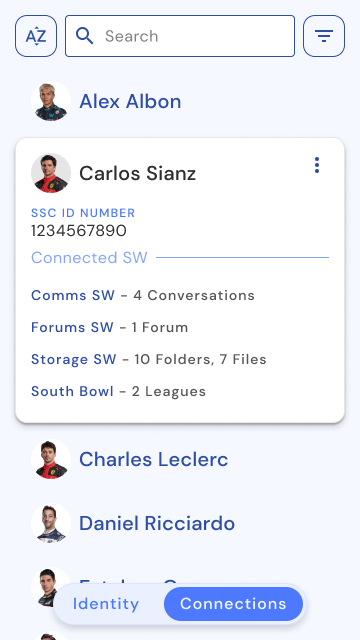
Once the user has entered their key and confirmed their identity, they have unlocked the full features of the software. The main features of the software are editing your ID, sharing your ID, and managing your ID connections.
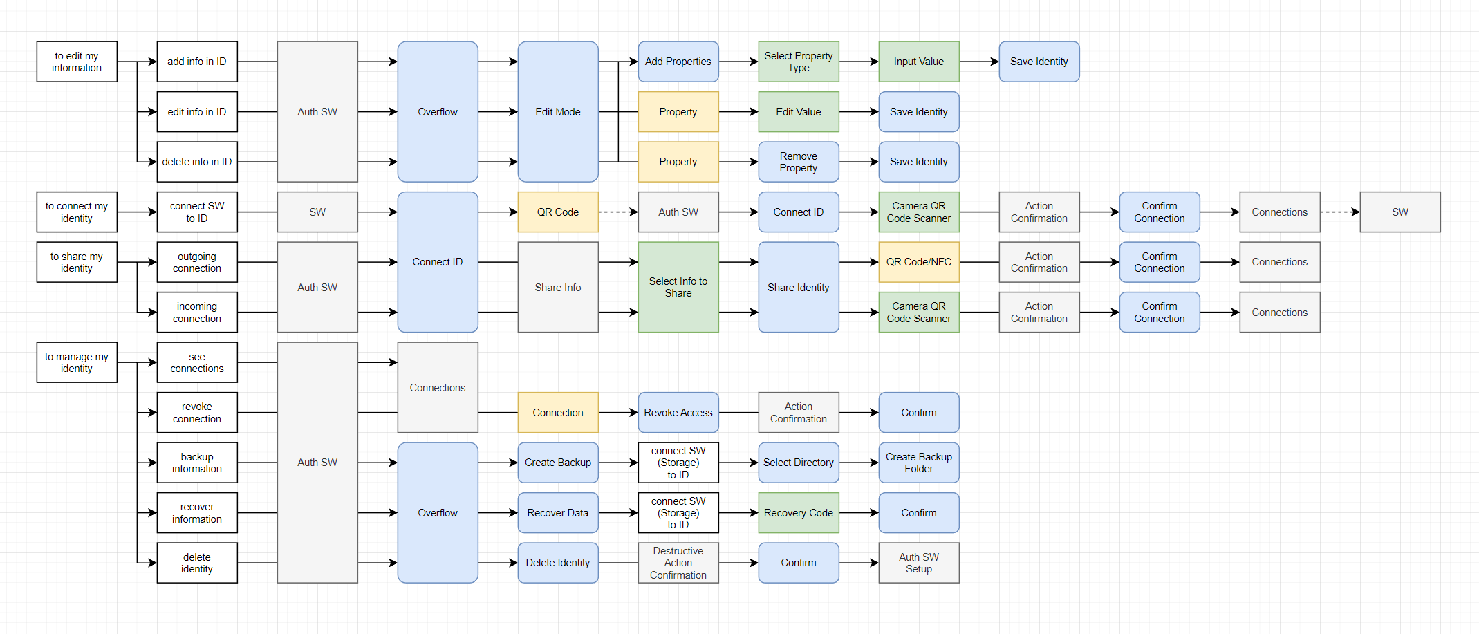
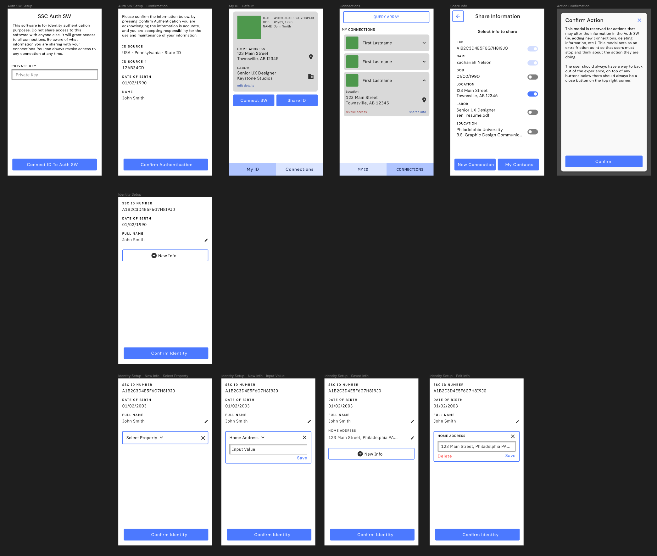
The interface has to be as simple and approachable as possible. This software is designed for anyone to use so styles, information, and actions should be clearly communicated follow existing UI norms. This software shouldn't feel like it's meant for a specific demographic.
Keystone Design System Figma Auth SW Figma Auth SW Prototype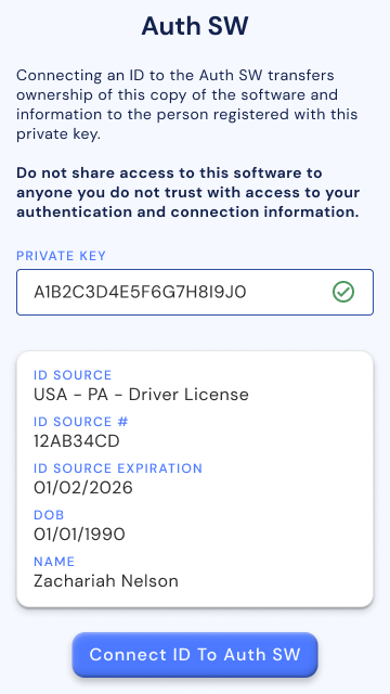
Libraries and educational institutions were the keepers of human information, with systems to help librarians and people to easily find what they're looking for. Personal information storage can be achieved with a simple file cabinet, shelves, and folders.
Digitally, file browsers and explorers are probably one of the first applications you bring up on a new computer. Cloud (fancy word for remote) storage solutions allowed people to access their information from any connected device.
Even with the ability to access your information from a central location, local storage is still considered the easiest to access, with cloud being used mostly for backups. Local storage also ensures the user has physical access to their information.
People are able to set up home servers that can be accessed through remote devices, but this is considered too complex and inconsistent for everyday use. The widest application is for home media solutions.
Streaming services also allow people to access information without having to save locally. Saving locally has become a premium feature to still access the content without a reliable internet connection.
A lot of information people would have saved locally has decreased as streaming services become more popular, which has decreased the need for larger local storage but increased the need for faster streaming and wider bandwidth.
The need for accessing information should be as simple as opening a folder. Folder structures are understood and accessible to anyone who understand the structure.
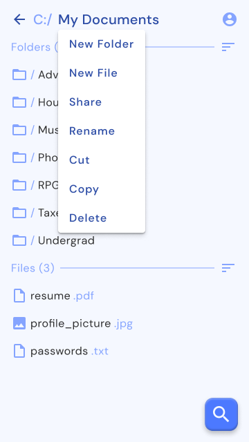
Most actions are simple and accessible with one or two interactions. Organizing and navigating are the primary actions, sharing and editing information are the secondary actions.
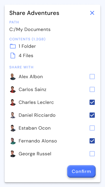
This software is designed to work with the other Keystone software, and has Auth SW integration so you can secure your information and share it between your connections.
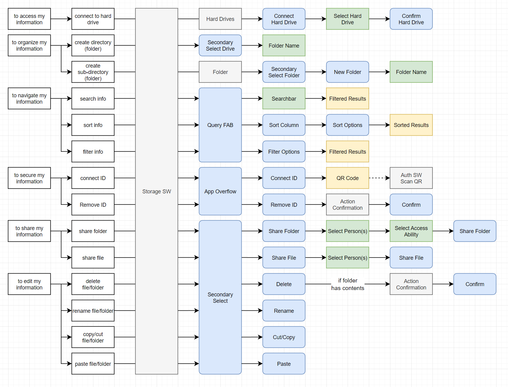

The UI follows the Keystone Design System shown in the Auth SW. This software introduces new components into the design system with more defined dividers, line items, and dropdown menus.
Keystone Design System Figma Storage SW Figma Storage SW Prototype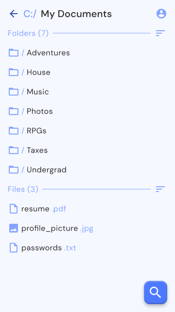
Communication is a fundamental aspect of humanity. Talking face to face is how people communicate, everything else is a derivative. Being able to talk to someone far away is the biggest challenge for any communication innovation.
Written language and stable mediums allowed people to record their thoughts and share them with other people without having to remember what they said or repeat it multiple times. Soon we were able to record audio and video signals so we can more directly talk to whoever is listening.
Phones allowed people to talk to each other over long distances. Video allowed people to record themselves visually, eventually allowing live video feed to be broadcasted.
The internet has only made these processes more powerful, with the ability to connect anyone to anywhere around the world. Talking and sending messages to your contacts is still the primary ways to communicate. Its the reason mobile smart devices are still called phones, their primary function is to communicate with your people.
Audio and Video Calls are still important aspects of communication, and there are hundreds of messaging applications that all perform very similar functions.
I personally have experience designing communication software in the past for Verizon. Back in 2014 we were trying to make the communication experience more consistent and consolidated.
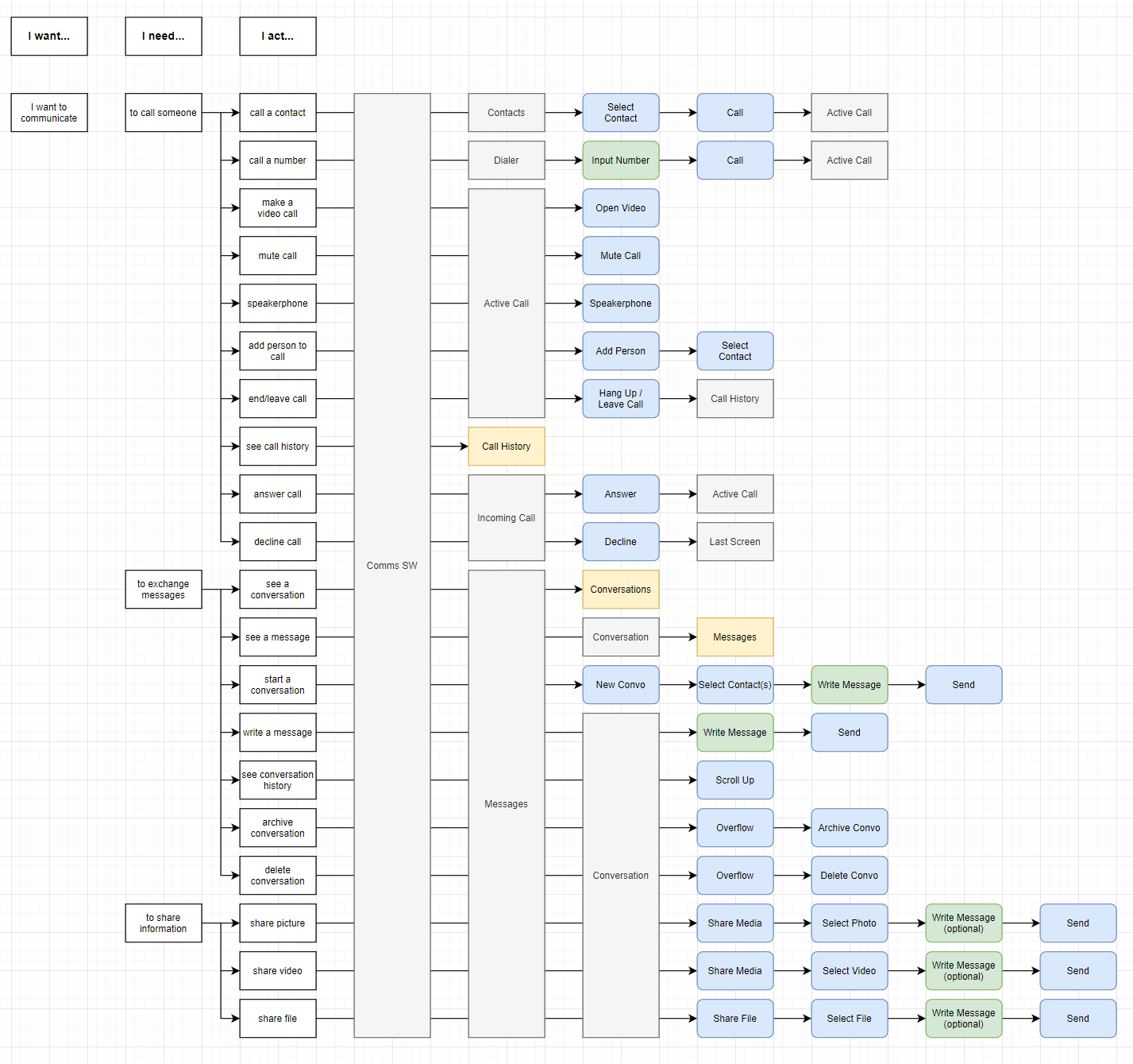
The biggest hurdle to designing a "communication platform" is that there are very different features that are hard to organize together, so it made sense to just make separate applications (ie. phone, voicemail, contacts, messages). With traditional phone and texting protocols making way for modern data solutions, we can easily offer a complete communications suite without having to jump in and out of applications.
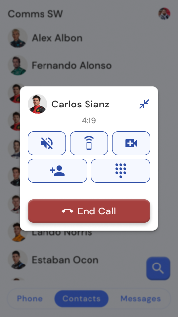
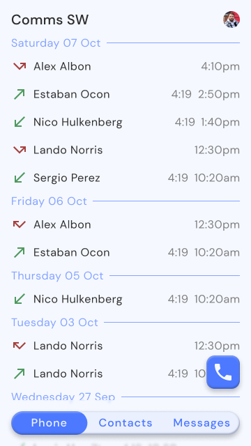
The voice experience is similar to existing phone apps that feature: a dialer, call history, incoming calls, and active calls. Voicemail has been deprecated and replaced with Voice Messages. When a call fails to connect it will prompt you to leave a voice message just as before. Instead of those messages living in a voice mailbox you had to call into, it will end up in your conversations along with the other text messages.
Text messages are similar to existing texting apps that have individual and group conversations that show you a list of messages being sent back and forth.
There is also a contact list that shows their communication history with you. This is not a fully featured contact list, similar to the connection list in the Auth SW. A dedicated Contacts SW will be available later.
The UI follows the Keystone Design System. This software introduces new components into the design system with more defined communication line items, messages, and audio call components.
Keystone Design System Figma Comms SW Figma Comms SW Prototype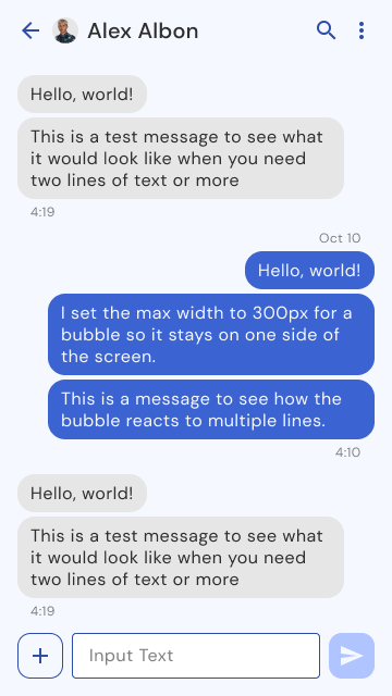
This project was from my junior level Corporate Branding class, we had to select an existing company to do a rebrand for. I selected a